Here we take a close look at the History Report builder, also known as the Fund Historical Costs and Returns Report.
The History Report allows us to deeply understand the costs associated with a specific ETF or Mutual Fund over a period of time, and also compare that fund’s cost profile against benchmark indices. You can also select a second fund to compare to the primary fund. Throughout this guide, we’ll refer to the second fund as the comparison fund.
To start a History Report, login and then click History at the top of the screen.

Note that you can also find a quick link to the History report near the bottom of any Cost Report.
How to Query for a History Report
After you click on the History link you will see this screen:
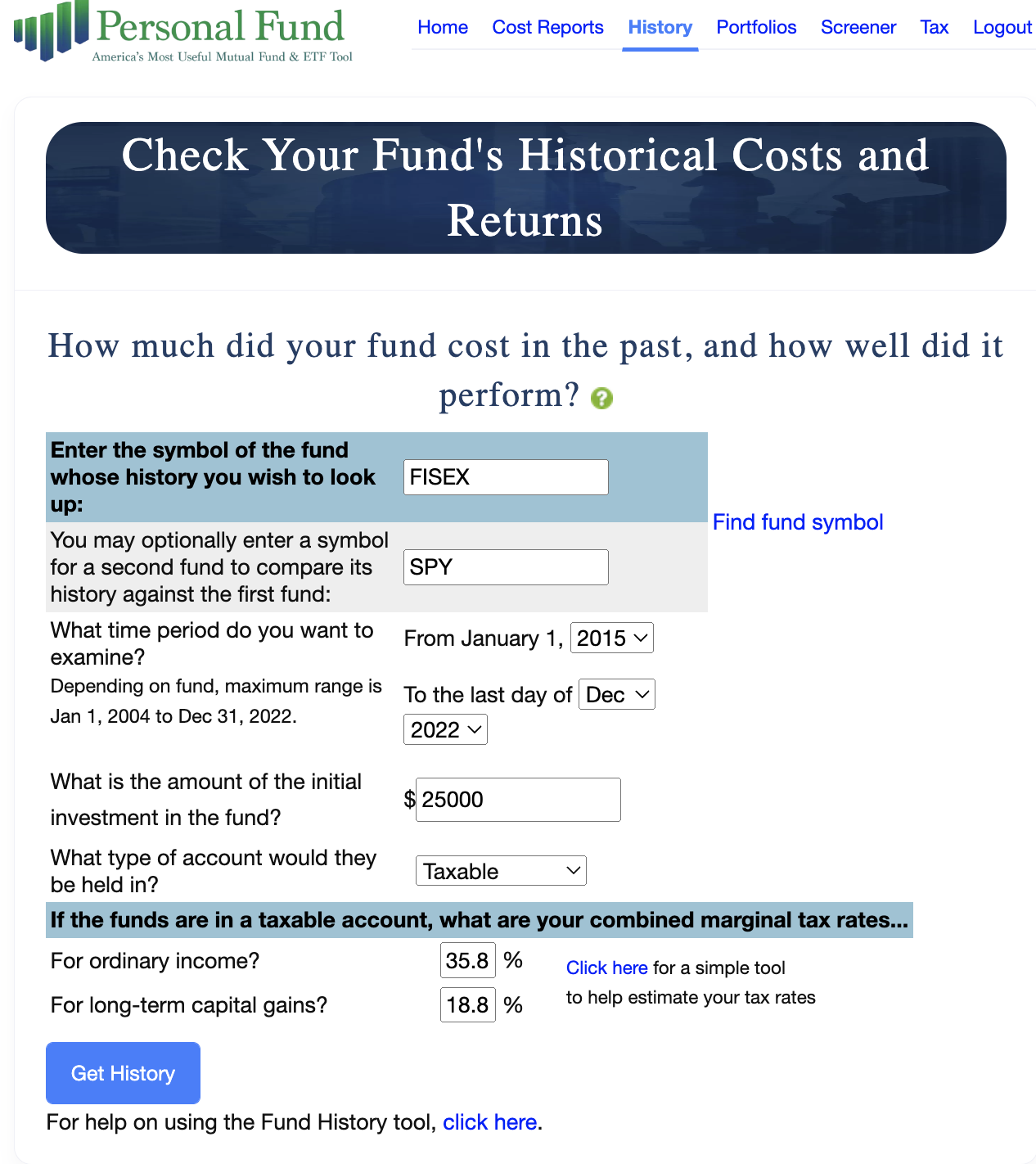
In the first field, enter the symbol of the fund you wish to generate a History Report for. If you don’t know the fund’s ticker symbol, you can click the “Find fund symbol” hyperlinked text to the right, to search for funds by name. Let’s use the Franklin Equity Income Class A for this example (FISEX). In the next field, let’s choose another fund to compare it to. How about the SPDR S&P 500 ETF Trust (SPY)?
Next, we’ll want to select a period of time over which we’d like to analyze the historical costs of our primary fund and comparison fund. Our chosen time periods can only begin on January 1 of a given year, but can end on the last day of any month and year for which we have comprehensive data on that fund. We’ll start this analysis on January 1 of 2015, and end on December 31st of 2022.
There are also just a few assumptions we need to choose before we can generate the report. For this example, let’s assume a $25,000 investment in a taxable account. We’ll also enter the ordinary income and long-term gains combined marginal tax rates. For this example, we’re using 35.8% for ordinary income and 18.8% for long-term gains. As with the cost report, we’ve provided a link to the tax estimator tool if you’re not sure what combined marginal tax rates to use. Note that the tax rates from your most recent report will auto populate for you here, so you don’t have to keep entering these rates every time you want to run another report with the same assumptions.
Finally, click Get History.
Fund History Report:
After about 5-10 seconds your report will generate. It begins with a Basic Fund Information section with basic info about the primary fund and comparison fund (if you chose to use one).
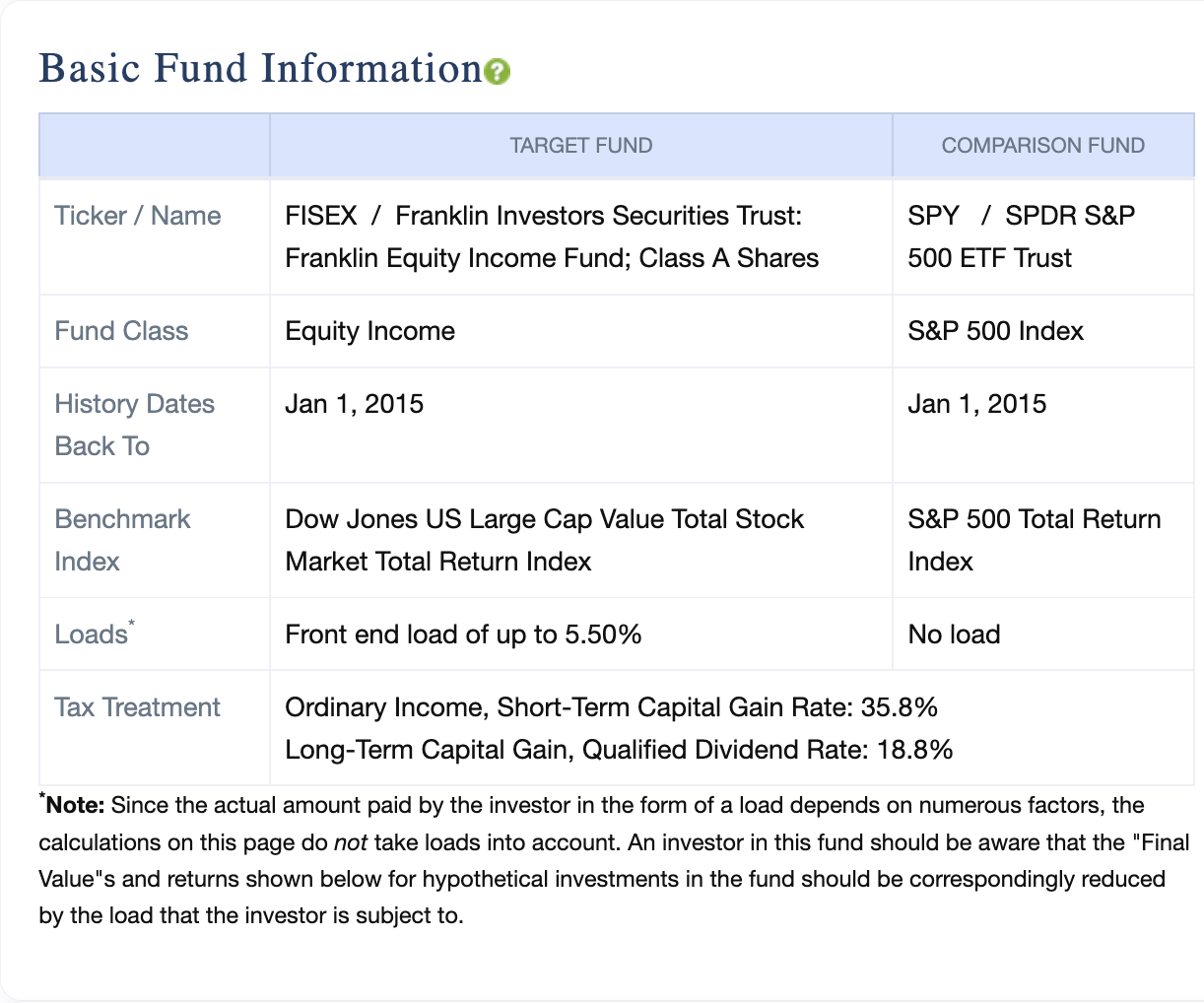
Not that the “History Dates Back to” row is the latter of the first date for which we have comprehensive data on the fund, or the date you chose on the previous page. We also put information about any loads in this section, since we do not include these loads in the analysis, given that actual loads paid by investors can vary widely.
Notice that every section title has a green circle with a question mark inside next to it. These icons are links and they take you to a more detailed explanation of the section. Use these throughout the report whenever you want to clarify what the tables and graphs are telling you.
The Summary Results section provides information on the hypothetical performance of your chosen funds, given your assumptions.
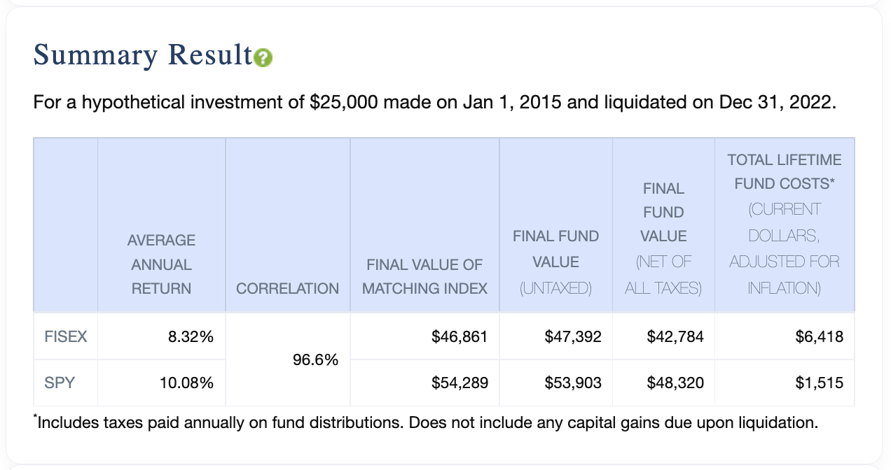
Here we see the average annual return of the fund, and the final value of the corresponding index next to the final value of the hypothetical fund investment, before and after taxes. Finally, this table shows the total costs associated with the fund over the given period. These are adjusted for inflation. This section is a great way to quickly see how your primary fund stacks up against the comparison fund historically.
Next is the Historical Expense Ratios and Turnover section.
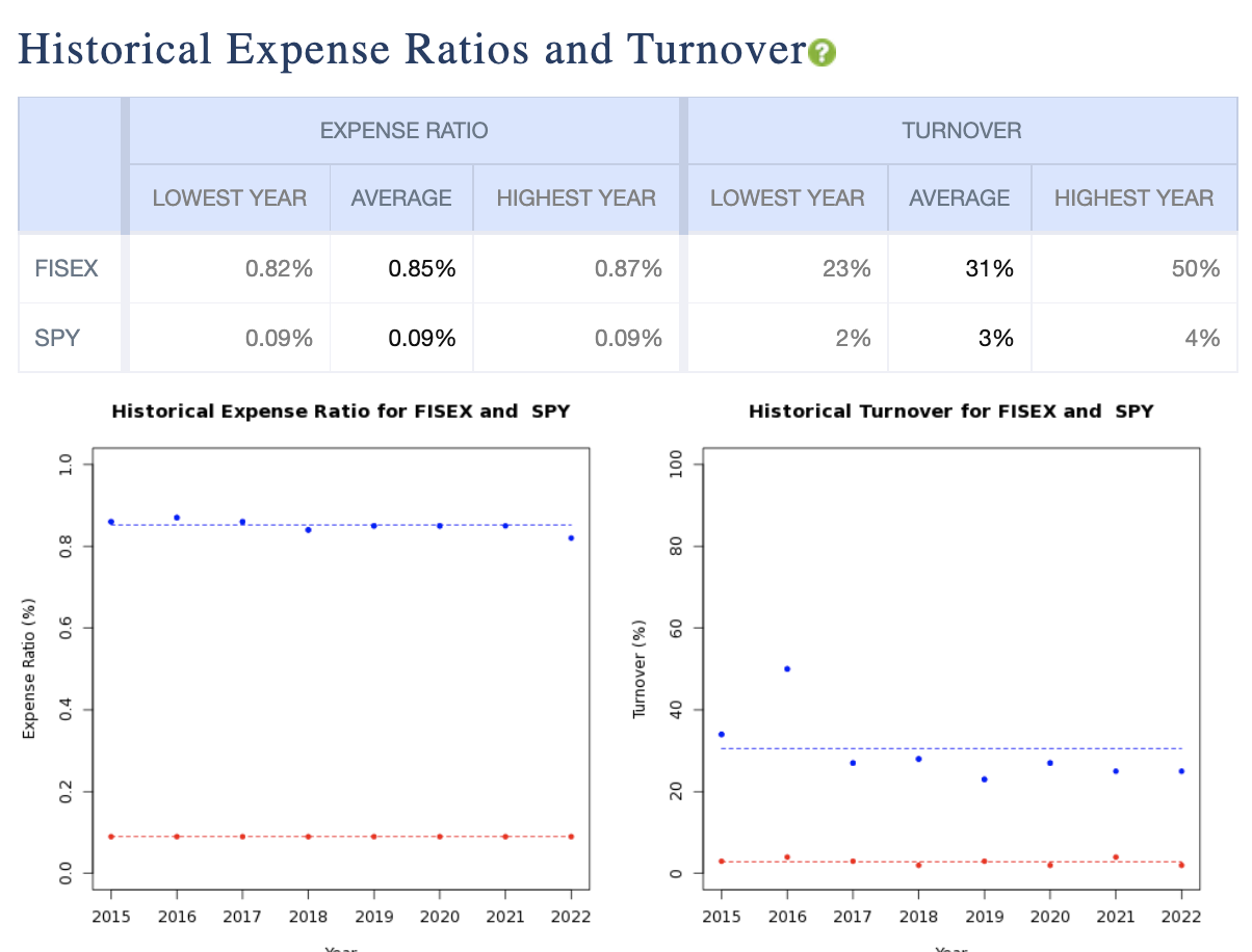
This provides the fund’s historical reported expense ratio and turnover ratio, by fiscal year. The graph on the left compares the expense ratios of the two funds over time where the dots are reported expense ratios for the year and the dashed line is the average over that period. The graph on the right presents a comparison of the historical turnover for both funds in the same manner. In all of the History Report graphs we represent the primary fund in blue, and the comparison fund in red.
The Historical Total Annual Percentage Cost section shows the total costs for each fund over time in the Total group.
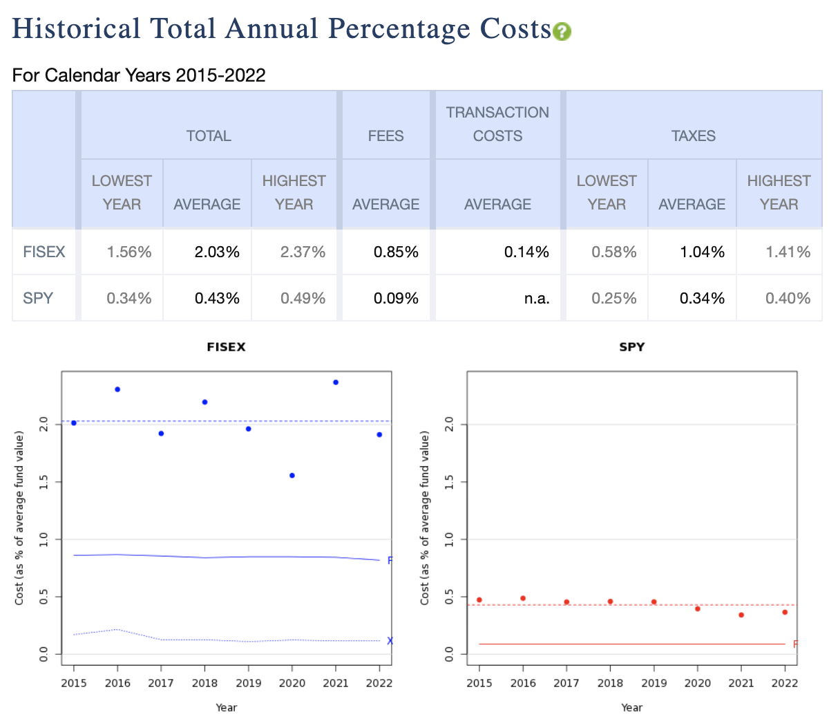
To the right, it breaks those costs out into their component parts (Fees, Transaction Costs, and Taxes). Then the two graphs visually represent the same information as a percentage of total fund value where:
- The dots represent the total costs for a given fiscal year
- The dashed line shows the average of those dots
- The solid line with an F to the right shows the fees from expense ratio
- The dotted line with an X to the right shows transaction costs, if applicable
Note that the taxes are not broken out in the graphs, but included in the total costs, so the two components shown (expense ratio and transaction costs) will not add up to Total Cost, unless you have selected “Tax-Sheltered” for the account type on the previous screen.
The Cumulative Costs Paid section breaks out the component parts of the total costs, then displays them in a cumulative graphical form over time.
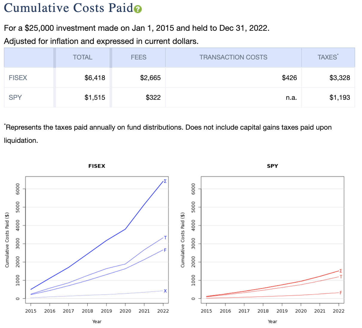
Note that throughout this report, the taxes shown are inclusive of annual taxes for distributions but, unless stated otherwise, exclusive of capital-gains taxes paid upon liquidation of the investment.
The Compounded Value After Inflation and Taxes section shows the value of the corresponding benchmark indices for each fund and their average annual return.
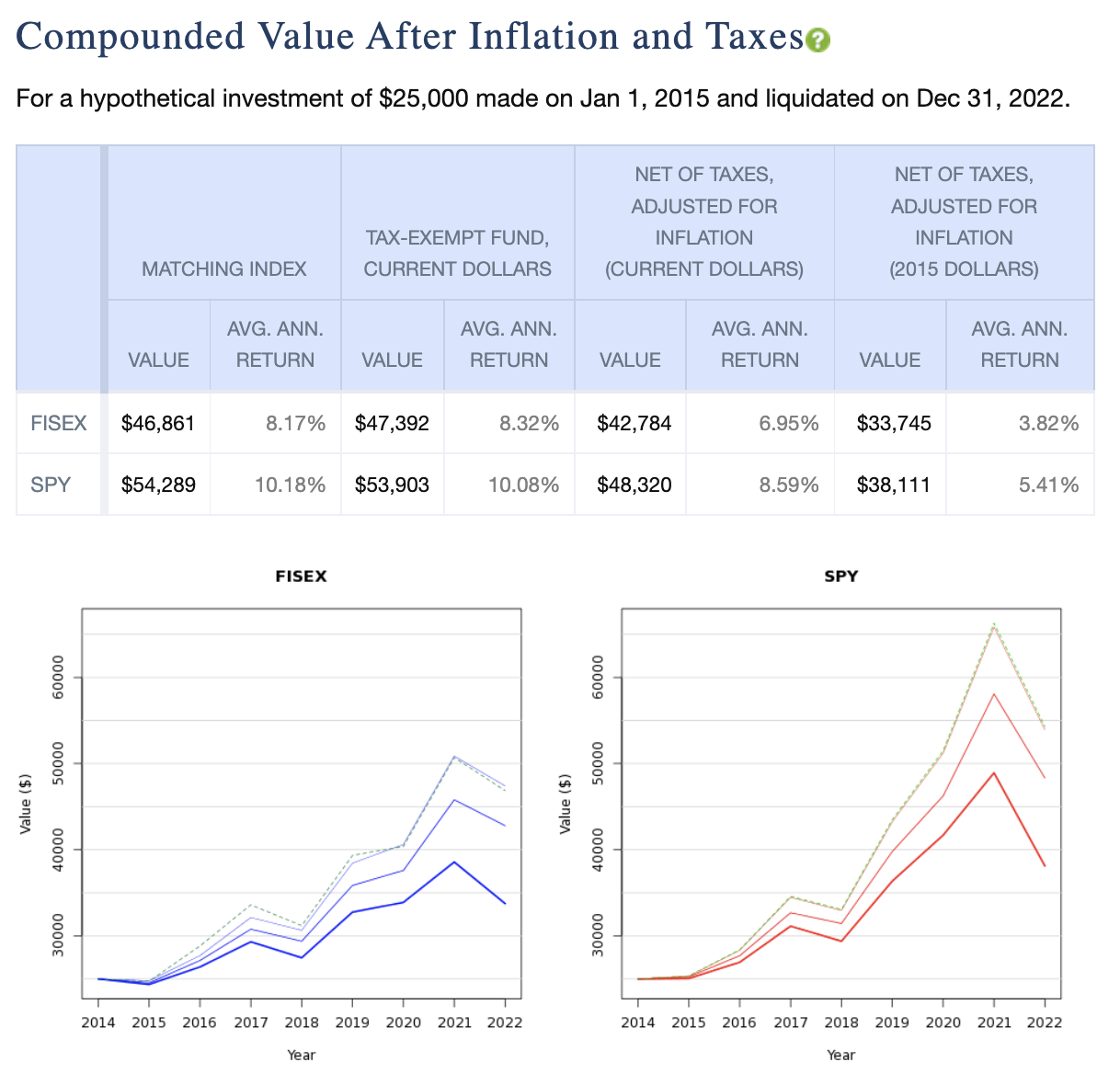
Keep in mind the corresponding indices for the two funds may be different. These values are then compared to up to three different representations of the funds’ hypothetical growth and average annual return over time.
- The tax-exempt value of each fund
- The net-of taxes value of each fund expressed in today’s dollars. There are some important assumptions to be aware of to understand this value. These include:
- All distributions are reinvested
- All taxes on dividend and capital-gains distributions are paid annually from other resources
- The total of taxes paid is deducted from the final fund balance
- The long-term capital gains tax included in the above, is deducted from the final value, where the basis includes all reinvested distributions.
- The taxes on distributions are adjusted for inflation and expressed in current dollars (as of the end date of the cost history report)
- The net-of taxes value of each fund adjusted for inflation as of the start date of the scenario. This is essentially the same calculation as the one above, but expressed in real dollars as of the start date.
This section may feel a little intimidating. Just think of this as a reasonable attempt to show what your investment would have done over this time period before taxes, after taxes, and after taxes adjusted for inflation, compared to its benchmark.
Next, we’ll find the Returns Relative to Benchmark Index section(s). The “s” is in parentheses here, because if you selected a comparison fund on the previous page, and that fund has a different benchmark index than the primary fund, there will be two of these sections and corresponding graphs – one for each benchmark.
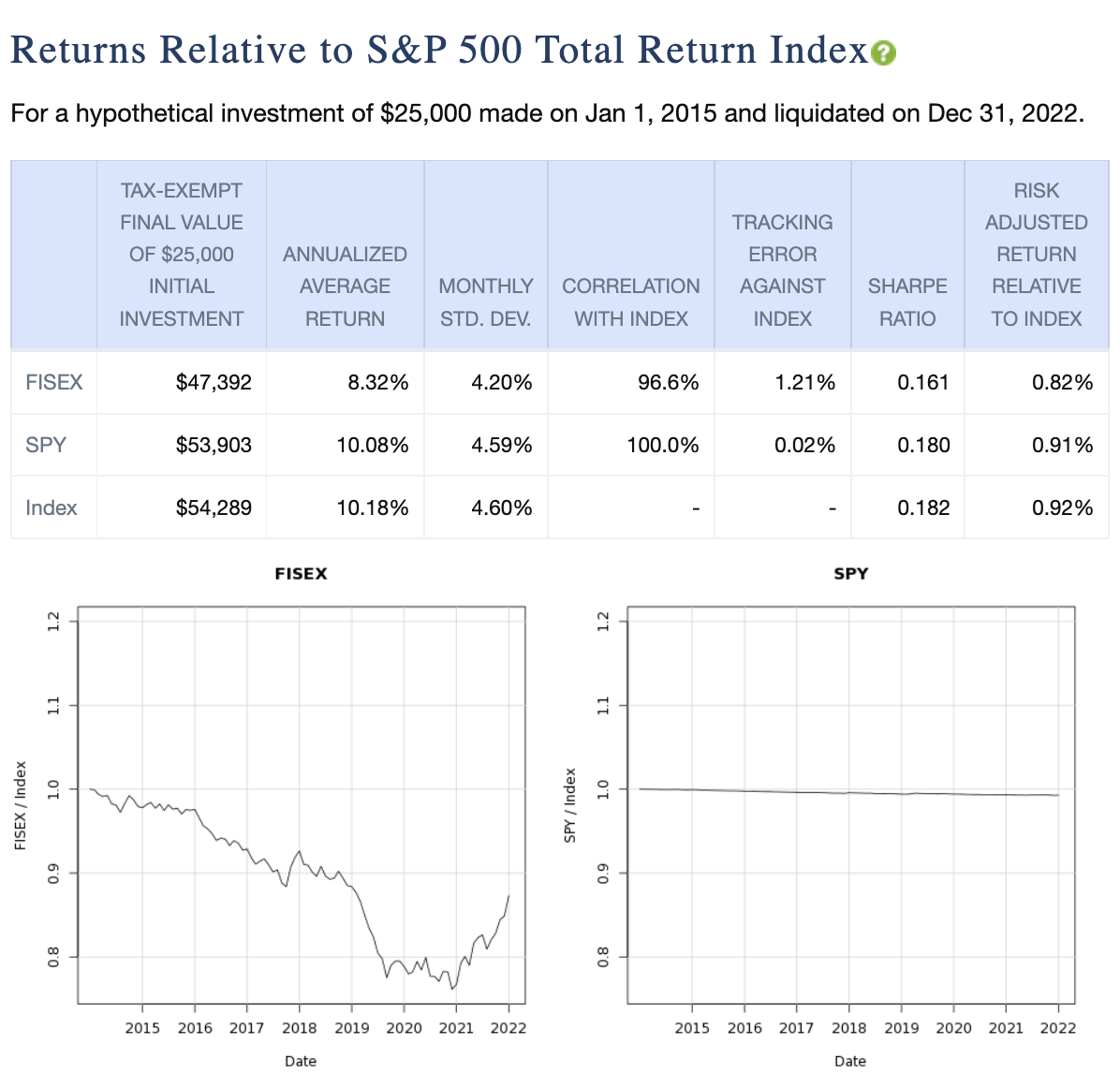
The section provides some useful data relative to how the funds performed against the given index.
- The tax-exempt final value of a hypothetical investment in each fund and the benchmark
- The annualized average return
- The monthly standard deviation
- The funds’ correlations with the index
- The funds’ tracking error against the index
- The Sharpe ratio of each
Click the green question mark symbol next to the section title to see detailed definitions for each of these. In essence, the graphs below show how a hypothetical investment in either of these funds would have performed relative to this index, where a value of 1 means identical value to hypothetically investing directly in the index, greater than 1 indicates outperformance relative to the index, and less than 1 indicates relative underperformance.
Again, if you have a comparison fund with a different benchmark index than the primary fund, you’ll see another similar comparison for both funds relative to that second index next.
The final section in this report contains the Comparative Results for Rolling 5-Year Periods graphs. It appears only if you’ve selected a comparative fund on the previous page. These graphs show the values of the two funds you’ve selected after the 5-year periods ending on each month within the graphs. The earliest 5-year period is the one ending five years after the start date, or the earliest period for which we have comprehensive data after that date. In this example, the earliest five-year period ends on December 31st, 2019 since our start date was January 1st, 2015.
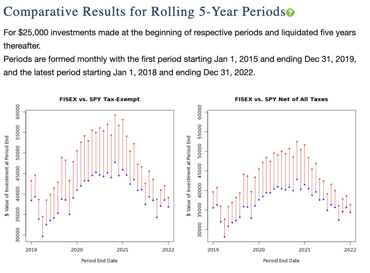
The first graph shows the tax-free values of your hypothetical investment, and the second graph shows the after-tax values and only appears if you selected “Taxable” for the account type on the previous page. Use the legend to determine which fund has outperformed the other, as indicated by the color of the connecting vertical lines.
Below this graph, you’ll see how many times one fund outperformed the other, as well as the median under- or over-performance of the primary fund vs. the comparison fund.
That concludes the History Report Builder How-To. Please refer to the detailed explanations of each section by clicking on the green question mark icon next to that sections title, and let us know if you still have outstanding questions about this report. E-mail us at support@personalfund.com.